How to Make the Biggest Impact with Your Attention-Seeking Infographic
As an Art Director, I am often tasked with creating a visually interesting display using otherwise mundane, boring facts. From printed posters to company-specific website content to industry blog posts, the key is to always deliver an attractive, high-quality image that will be understood, remembered and shared.
 For a few years infographics have been a key element in driving social media engagement. More views and more “Likes” mean more followers and more business. The increasing use of videos and photos has led to the rise of YouTube and Instagram. Even Twitter now pulls pictures and videos into the timeline. But why do visuals work so well?
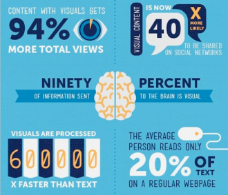
What happens when I state these mind-blowing statistics: visual content is processed by the brain 600,000 times faster than text and 90 percent of information transmitted to the brain is visual? How is the impact different if I share that information using an infographic by Ethos3.
The human brain processes visual cues in a quarter of a second, and the average attention span of a consumer is eight seconds. This means a designer must rely on obvious connections that already exist in the human mind. For instance, a pedestrian crossing or no smoking sign does not contain any words. Similarly, icons in an infographic should be instinctual.
This set of icons by Bandwagon Digital Media are not only examples of intuitive images, but also display the various considerations a designer must navigate to transform plain text into an attractive infographic. Remember, asking a viewer to absorb information from a graphic is asking them to invest in the experience. The design should direct the mood of the audience based on the content of the entire collateral where the graphic will be placed.
Is the framework soothing, gritty, exciting? Colors and textures influence human emotion. For a children’s brochure, I might use primary, pastel or neon colors, with more symbols than text. For a government website, I might stick to red, white and blue, with more exact, detailed text.
Show some restraints. Most infographics are just well-organized tweaks to basic bar graphs, or other types of tables or flow charts. A modern, grid-based layout gives breathing space with portions of “white space” to let the viewer step inside the graphic. It should not be so cramped that the reader cannot maneuver the space to find information.
Thanksgiving with the Mopdog Pack
The pack got together to share about what we are thankful for as well as our…
Read MoreArt, Community and Fun: Supporting the 2021 Chalktoberfest
Chalktoberfest is an excellent start to the fall season, and our pack was very excited to…
Read MoreWe Would Love to Hear from You.
3104 Creekside Village Drive, Suite 507, Kennesaw, GA 30144
New Business
William Musial
[email protected]
678-737-7333
Media Relations
Cheryl Musial
[email protected]
678-737-7325


