Logos that Standout…In a Good Way
 Visual identity is how a company is packaged to clients and customers. Even something as simple as a logo will not only be the first, but often times, the lasting impression left by an organization. The logo sets the tone for how you are perceived and reaffirms how the public feels about your company. Essentially it is a symbol that should validate what your company claims to be.
For a new business, the branding process starts with determining the color palette, font style and symbols that will lead to a finished logo. Important decisions must be made early, such as what tone to set with color choices. You don’t want to hit a wrong note by being too bright, too dark, too contrasting or too forgettable. Will a symbol or imagery be used to express a  powerful emotion, youthful quirkiness, reliable strength or forward innovation? Even the font style can have the biggest impact. In type-only logos, like Coca-Cola, the company name is the only symbol.
These brand specifics are determined after hours of concepting. For an insider’s view on the logo design process, I highly suggest watching “Aaron Draplin Takes On a Logo Design Challenge.” This video is an edited, concise summary that shows the artistry in logo design. It also highlights how a logo is more than one piece of collateral, but a vast effort to leave a “good mark” everywhere. The imagery must be broken down and retooled for print magazines, outdoor advertising, business cards, online digital communications, sales materials and even as wrapping for company vehicles.
Logo Fails and Successes…In the Public Eye
In Erik Devaney’s HubSpot blog, “Gap, Starbucks, Vodafone & Airbnb: 4 Important Lessons From Famous Rebrands,” he reviews famous rebrands of highly recognized corporations. One major lesson is that severely altering the simplest logo can compel the public to comment with harsh critiques. In one specific case, Gap, Inc. changed from a classic look (that gave a sense of status and self-awareness) to a more generic, wimpy design.![]()

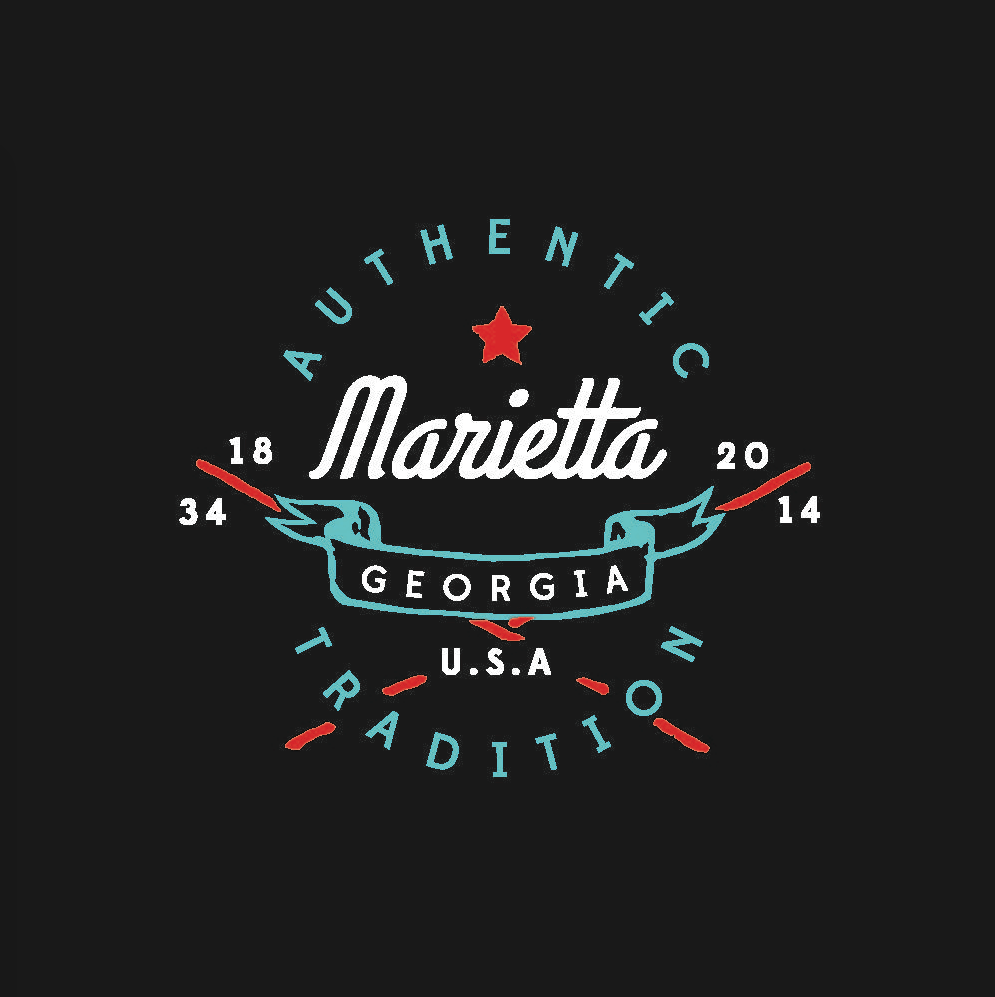
In other cases, companies did not reinvent the entire logo, but simplified it—taking away layers and text, for a clean iconic image. At Mopdog, we have seen this industry trend to simplify existing logos. Updates strip away any wording to rely on one powerful image or ditch a traditional border for better use of white, or negative, space. These examples harken back to the best period of logo development—the 1950s. The simple time period had to rely on basic design techniques that resulted in classic, timeless and effective logos, which has led to a resurgence of nostalgic imagery for today’s established companies.
In the end, the best advice is to not be obvious, predicable or mimic other branding. That doesn’t mean a company should go too abstract, with a confusing, convoluted logo that gets lost in translation. Still, a hidden meaning can be the best aspect of a great logo. Can you find the marketing messages behind these two famous logos? Hint: One includes a “one-the-way” arrow and the other makes you smile from a to z.